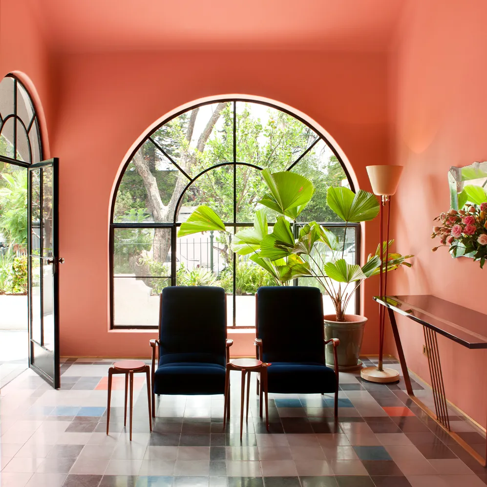
Casa Habita
Words Vidula KotianDate 17 April 2019
Pantone’s Color of the Year 2019, Living Coral, has brightened up our lives in fashion, beauty, electronics, and accessories. But what about hotels? If just to see this happy color in different manifestations, here is a roundup of all our hotels featuring this orangey-pink hue Pantone describes as “animating and life-affirming.” First on this list is Casa Habita in Guadalajara, Mexico. Designed by Dimorestudio, the spaces are characterized by an Art Deco approach, with clear references to design from the 1940s, punctuated by bright colors.
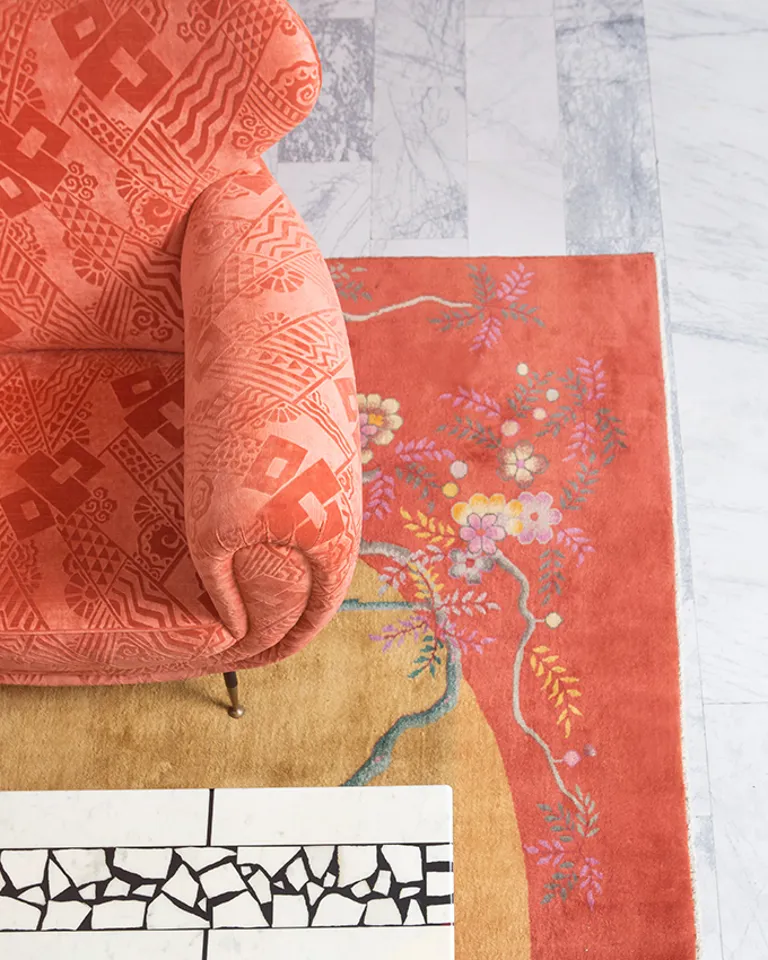
San Francisco Proper Hotel
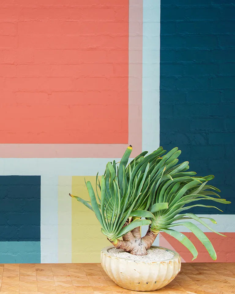
Avalon Hotel Beverly Hills
Over in San Francisco, designer Kelly Wearstler has created a new neighborhood beacon in the Mid-Market area—San Francisco Proper Hotel. The interiors here are a happy tapestry of deep colors, rich textures, classic design pieces, and found vintage furniture. Wearstler has also created a quintessentially L.A. experience at the Avalon Hotel Beverly Hills where she pored over photos of the original design by legendary graphic designer Alvin Lustig and reinterpreted it with her own dramatic style.
In southern Italy, amid rambling citrus groves and boasting sublime views over Mount Etna, you’ll find Zash: a country hideaway, a former winery, and a Mediterranean garden that offers you a tantalizing taste of Sicily. Architect Antonio Iraci was awarded “Ischia International Architecture Award for excellence in architecture” for this project.
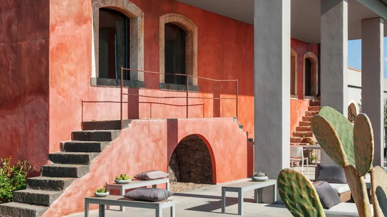
Zash Country Boutique Hotel
It’s hard to imagine when you step into the vibrant elegant world of The Soho Hotel in London that it was the site of a former multi-story car park. Interior designer Kit Kemp does not approach design with a fixed idea in her mind, but rather creates her look hands-on through mixing, matching, and experimentation.
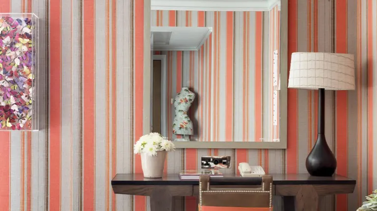
The Soho Hotel